
Who This Is For
This article is for readers who already know how to draw one-variable charts and now want to compare variables against each other. The goal is not just to memorize more geoms. It is to learn which relationship question each plot type answers best.
What You Will Do
- Use a scatter plot for two numeric variables.
- Use boxplots and violin plots for numeric values grouped by category.
- Use a line plot for ordered data such as time.
- Learn how
color,shape, andsizecan reveal a third variable.
Before You Start
- You should already know the core
ggplot()+aes()+geom_*()pattern. - You need
ggplot2,palmerpenguins, anddplyr. - You should understand the difference between numeric, categorical, and ordered variables.
The companion script for this article is:
R draw/scripts/03-ggplot-from-zero-relationships.R
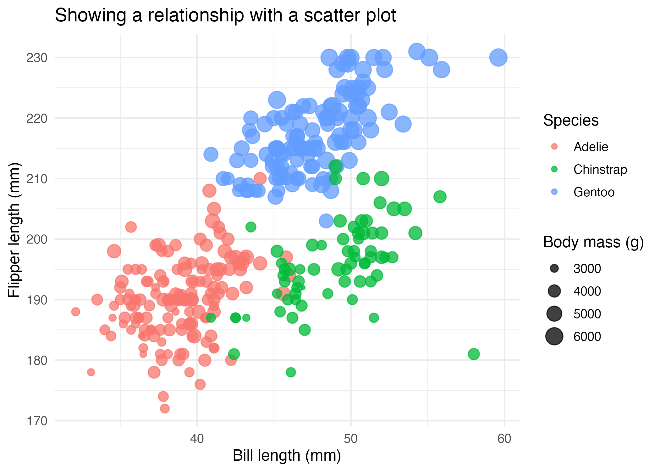
Step 1: Use a Scatter Plot for Two Numeric Variables
Scatter plots are the default choice when both variables are numeric.
ggplot(
  penguins_clean,
  aes(
    x = bill_length_mm,
    y = flipper_length_mm,
    color = species,
    size = body_mass_g
  )
) +
  geom_point(alpha = 0.75)
This works well because:
xandyhold the main relationshipcolorseparates speciessizeadds a third numeric cue
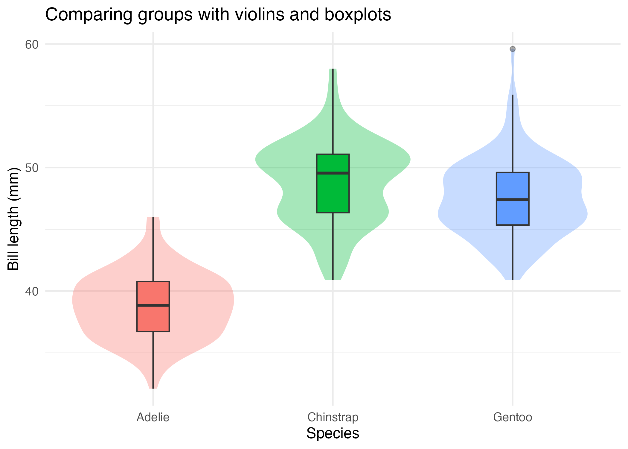
Step 2: Use Boxplots or Violins for Grouped Numeric Comparisons
When you want to compare one numeric variable across categories, boxplots and violin plots are often more appropriate than scatter plots.
ggplot(
  penguins_clean,
  aes(x = species, y = bill_length_mm, fill = species)
) +
  geom_violin(alpha = 0.35, color = NA) +
  geom_boxplot(width = 0.18)
This combination is useful because:
- the violin shows shape
- the boxplot shows median and spread
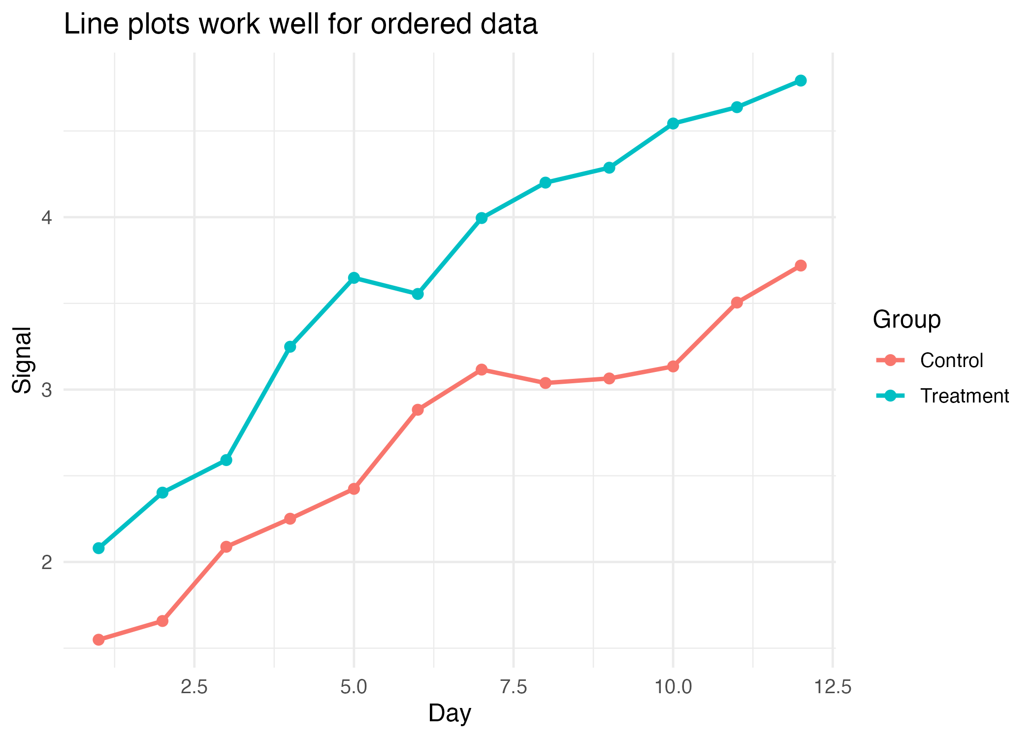
Step 3: Use a Line Plot for Ordered Data
A line plot makes sense when the x-axis has an order that matters, such as time or step number.
ggplot(time_series, aes(x = day, y = signal, color = group)) +
  geom_line(linewidth = 1) +
  geom_point(size = 2)
Without an ordered x-axis, line plots often imply a story that is not really in the data.
Step 4: Choose the Plot Based on the Question
Use this rule of thumb:
- two numeric variables: scatter plot
- one numeric variable grouped by category: boxplot or violin plot
- one ordered sequence: line plot
You do not need all plot types at once. You need the one that matches your question.
How to Confirm It Worked
- Your script creates:
R draw/figures/03-relationship-scatter.pngR draw/figures/03-relationship-violin-box.pngR draw/figures/03-relationship-line.png
- You can explain why the line plot uses an ordered x-axis.
- You can explain why the violin/boxplot example is better than a scatter plot for grouped distributions.
Common Questions
When should I facet instead of mapping more variables?
If the plot starts feeling crowded or if the groups overlap too much, faceting is often easier to read than adding more aesthetics. Article 5 will focus on that choice.
Is size always a good idea for a third variable?
No. It is useful when the third variable is numeric and differences are large enough to see clearly. Small size differences are often hard to interpret.
Why combine a violin and a boxplot?
Because each shows a different aspect of the same grouped distribution, and together they are often more informative for beginners than either one alone.
Review Score
Score: 92/100 Verdict: This draft is ready for human review and gives beginners a practical map from question type to plot type.
Show Explanation
Score Breakdown
- Accuracy: 23/25. The plot choices match standard ggplot practice for relationship questions.
- Beginner friendliness: 24/25. The article keeps each geom tied to a specific question rather than presenting them as a random catalog.
- Reproducibility: 23/25. The examples are scripted, generated, and use stable datasets plus one reproducible synthetic time series.
- Professional judgment and risk handling: 22/25. The article warns against using line plots without meaningful order, which is an important beginner safeguard.
Review Notes
- Ready for human review.
- Before publication, consider one extra sentence about overplotting and when jitter can help.
```
Personnel
- ✍ Creator: Chenglin Cai
- 🤖 AI Collaboration: ChatGPT
- 🧪 Data Provider: palmerpenguins package dataset and synthetic example data
- 💻 Code Contributor: ChatGPT