
Who This Is For
This article is for readers who can already draw a few plots but still feel that ggplot2 behaves like magic. The goal here is to make the grammar visible: what a layer is, what mapping means, what setting means, and why different positions change the same data into different visuals.
What You Will Do
- Build one plot in stages.
- Compare
mappingandsetting. - Compare
stack,dodge, andjitter. - Understand how a ggplot object grows layer by layer.
Before You Start
- You should already be comfortable with basic
ggplot()and a few simplegeom_*()calls. - You need
ggplot2,dplyr, andpatchwork. - You should be willing to read one plot as a combination of decisions rather than a single command.
The companion script for this article is:
R draw/scripts/04-ggplot-from-zero-how-ggplot-builds-a-plot.R
Step 1: Build a Plot in Stages
Here is the most important grammar idea in ggplot2:
ggplot(data, aes(...)) + layer_1 + layer_2 + layer_3That means you are not issuing one magical plotting command. You are assembling a plot object piece by piece.
The companion script saves a side-by-side comparison of a simpler stage and a richer stage:
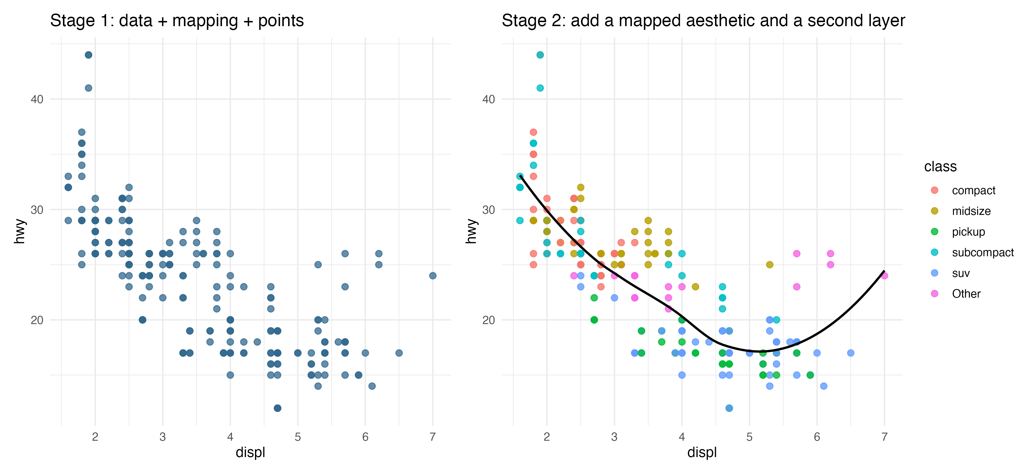
The left panel shows a first layer with points. The right panel adds a mapped aesthetic and a smoothing layer. This is how a ggplot grows.
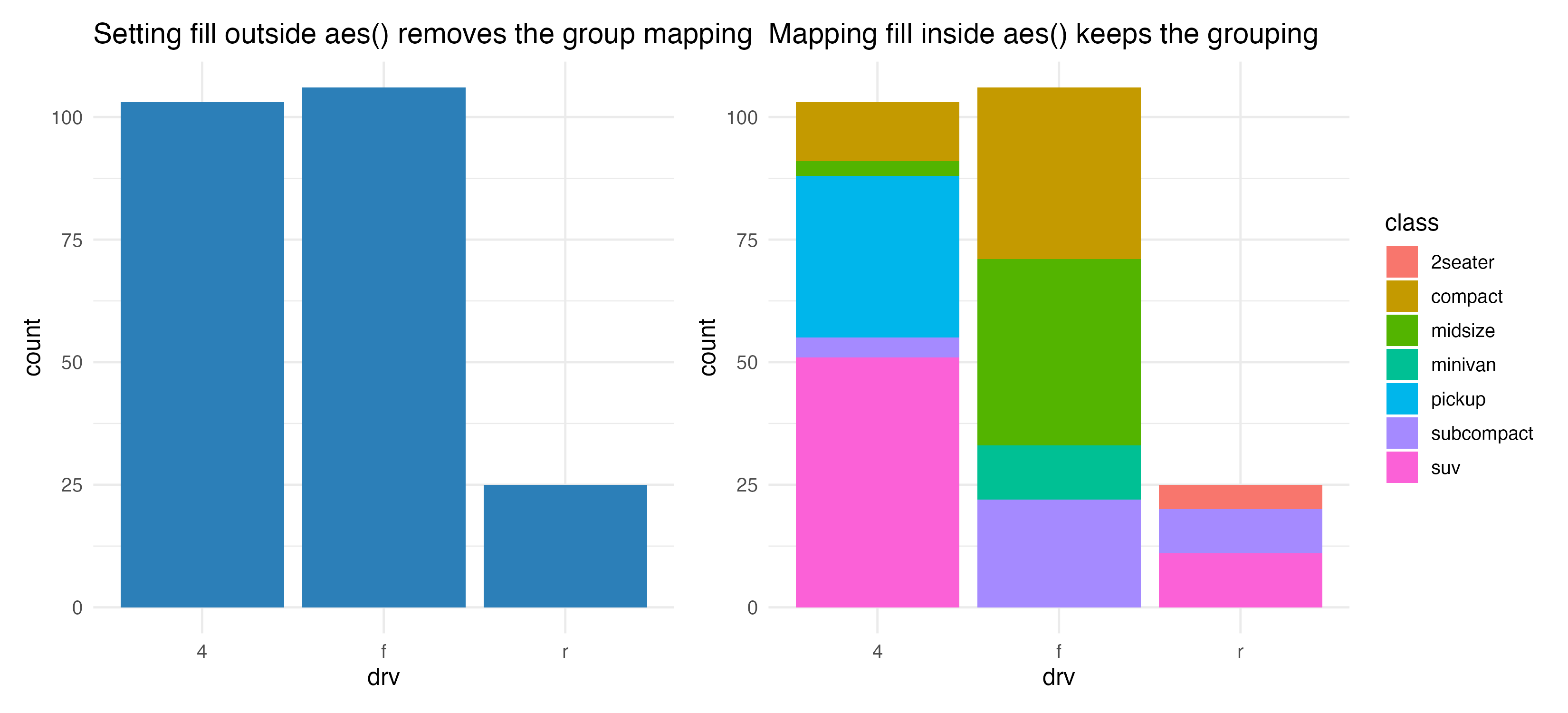
Step 2: Understand Mapping vs Setting
One of the most important beginner distinctions is this:
- mapping happens inside
aes() - setting happens outside
aes()
Example:
ggplot(mpg, aes(x = drv, fill = class)) +
  geom_bar()
Here fill = class maps a variable from the data.
Now compare it with this:
ggplot(mpg, aes(x = drv, fill = class)) +
  geom_bar(fill = "#2C7FB8")
Now fill is being set to one fixed color. That means the grouped fill mapping is no longer visually visible.
Step 3: Learn Position Adjustments
The same bar or point geometry can communicate different things depending on position.
The script compares three common choices:
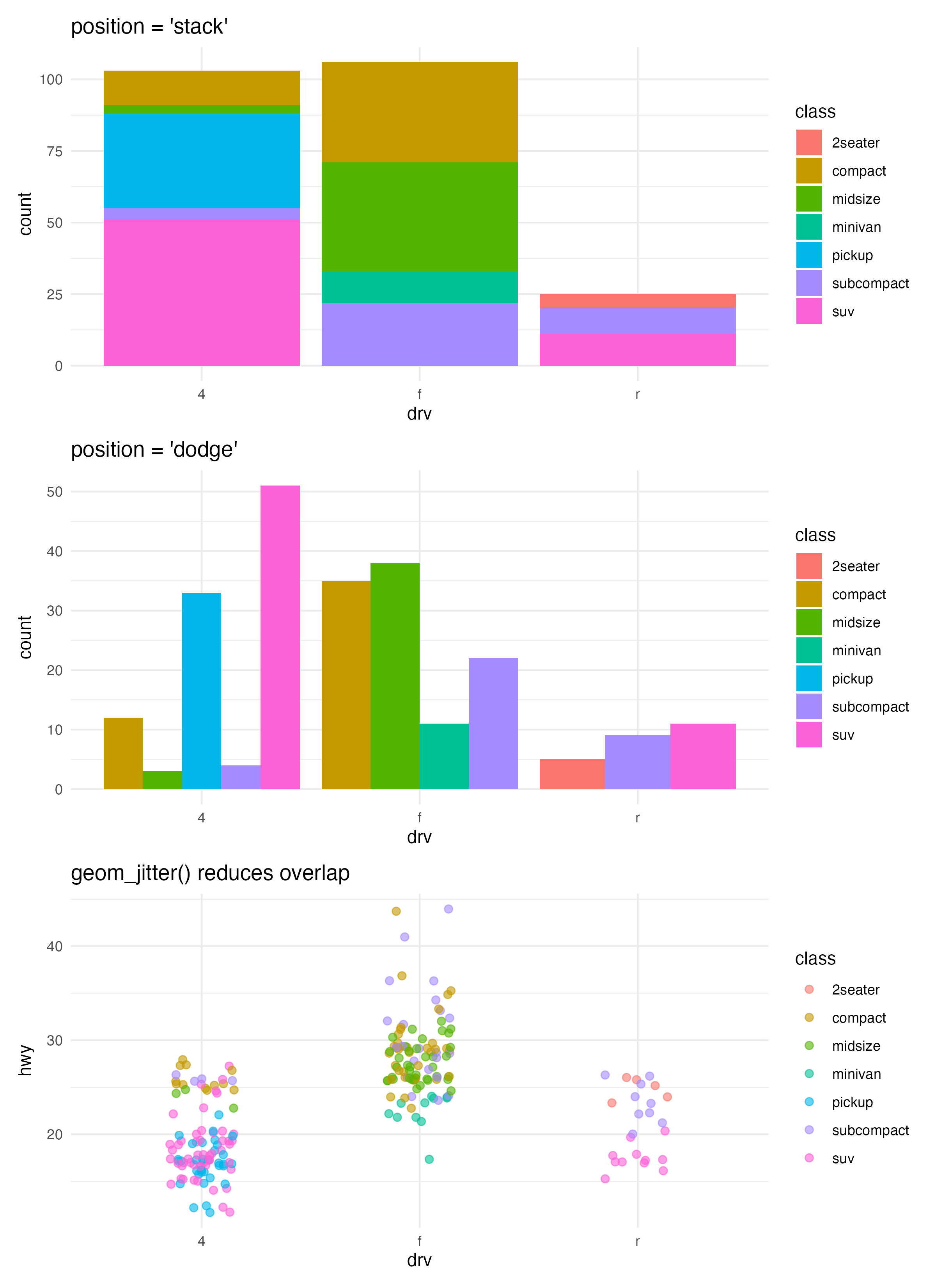
Use them like this:
stack: default for grouped bar countsdodge: place groups side by sidejitter: reduce overlap in points
These are not cosmetic changes. They change how your reader compares the data.
Step 4: Use the Grammar as a Thinking Tool
When a plot looks wrong, ask:
- Did I choose the right data?
- Did I map the right variables in
aes()? - Did I pick the right geometry?
- Did I accidentally set a constant where I meant to map a variable?
- Is the position adjustment helping or hiding the comparison?
That checklist is often more useful than memorizing more syntax.
How to Confirm It Worked
- Your script creates:
R draw/figures/04-build-stages.pngR draw/figures/04-position-adjustments.pngR draw/figures/04-wrong-vs-correct.png
- You can explain the difference between mapping and setting without looking at notes.
- You can explain why the same bar chart data looks different under
stackanddodge.
Common Questions
Why does ggplot use + between layers?
Because each new layer is added to an existing plot object. That design reflects the grammar: plots are assembled from components.
Is geom_smooth() a new plot type?
No. It is a new layer added to an existing plot. The base scatter plot is still there underneath.
Why not teach every geom before teaching grammar?
Because without the grammar, beginners often memorize disconnected code. Grammar gives structure to everything that comes later.
Review Score
Score: 94/100 Verdict: This draft is ready for human review and gives the series its first strong conceptual backbone.
Show Explanation
Score Breakdown
- Accuracy: 24/25. The article explains ggplot layering and position adjustments in a way that matches the package design.
- Beginner friendliness: 24/25. The grammar is introduced through concrete comparisons instead of abstract theory.
- Reproducibility: 24/25. The companion script generates all comparison figures directly.
- Professional judgment and risk handling: 22/25. The article focuses on the most reusable concepts and avoids low-value syntax dumping.
Review Notes
- Ready for human review.
- Before publication, consider adding one short note about how
stat_*differs fromgeom_*in more detail, or defer it explicitly to a later article.
```
Personnel
- ✍ Creator: Chenglin Cai
- 🤖 AI Collaboration: ChatGPT
- 🧪 Data Provider: ggplot2 package dataset
mpg - 💻 Code Contributor: ChatGPT