
Who This Is For
This article is for readers who can already build basic plots, but whose figures become crowded when they try to compare groups. The goal is to show how facets, scales, and coordinates help you structure the reader’s attention instead of forcing every comparison into a single panel.
What You Will Do
- Use
facet_wrap()andfacet_grid(). - Decide when fixed scales or free scales are more appropriate.
- Control axis breaks and labels.
- Use
coord_flip()andcoord_fixed()intentionally.
Before You Start
- You should already know how to build basic ggplot layers.
- You need
ggplot2,palmerpenguins, anddplyr. - You should understand that a crowded single panel is often a design problem, not just a syntax problem.
The companion script for this article is:
R draw/scripts/05-ggplot-from-zero-facets-scales-coordinates.R
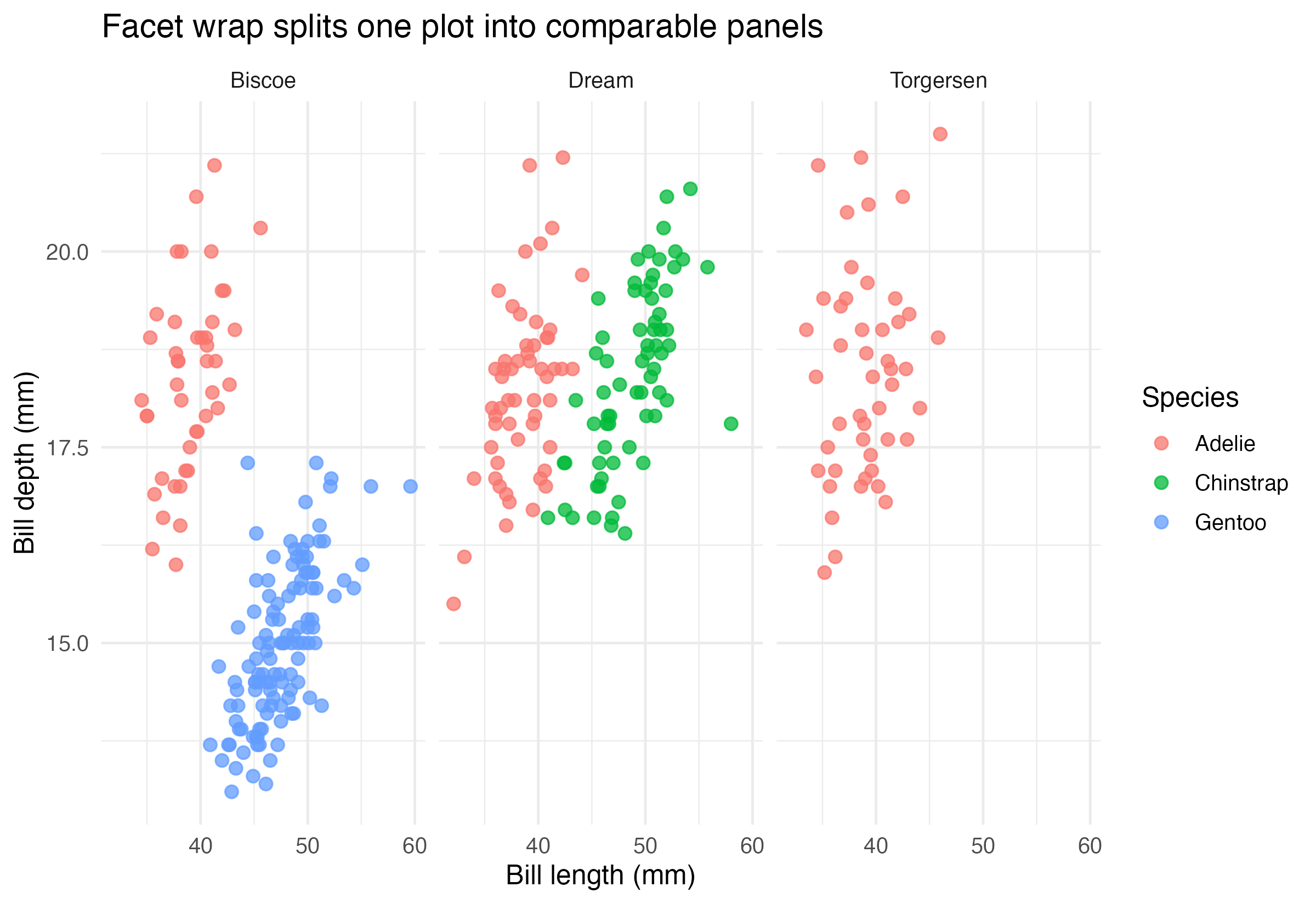
Step 1: Split a Plot with facet_wrap()
If color and shape are not enough, do not keep adding more mappings automatically. Sometimes the cleaner choice is to split the plot into panels.
ggplot(
  penguins_clean,
  aes(x = bill_length_mm, y = bill_depth_mm, color = species)
) +
  geom_point(alpha = 0.75) +
  facet_wrap(~ island)
This creates one panel per island so the reader can compare the same relationship in multiple contexts.
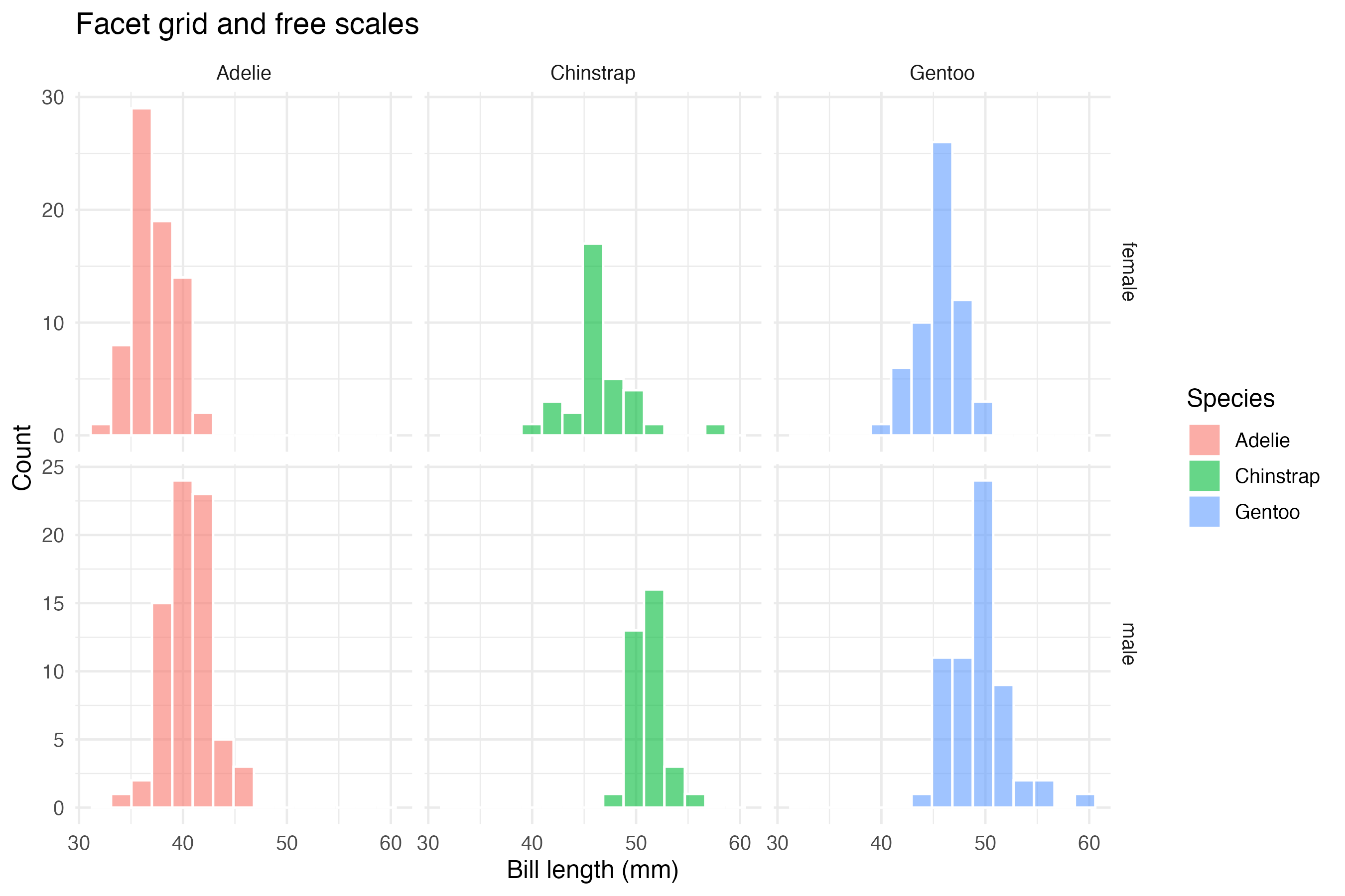
Step 2: Use facet_grid() When Rows and Columns Both Matter
facet_grid() is useful when you want one variable to define rows and another to define columns.
ggplot(
  penguins_clean,
  aes(x = bill_length_mm, fill = species)
) +
  geom_histogram(bins = 15, alpha = 0.6, color = "white") +
  facet_grid(sex ~ species, scales = "free_y")
Important parameters here:
sex ~ speciescreates a row-by-column layoutscales = "free_y"allows each panel to use its own y-axis range
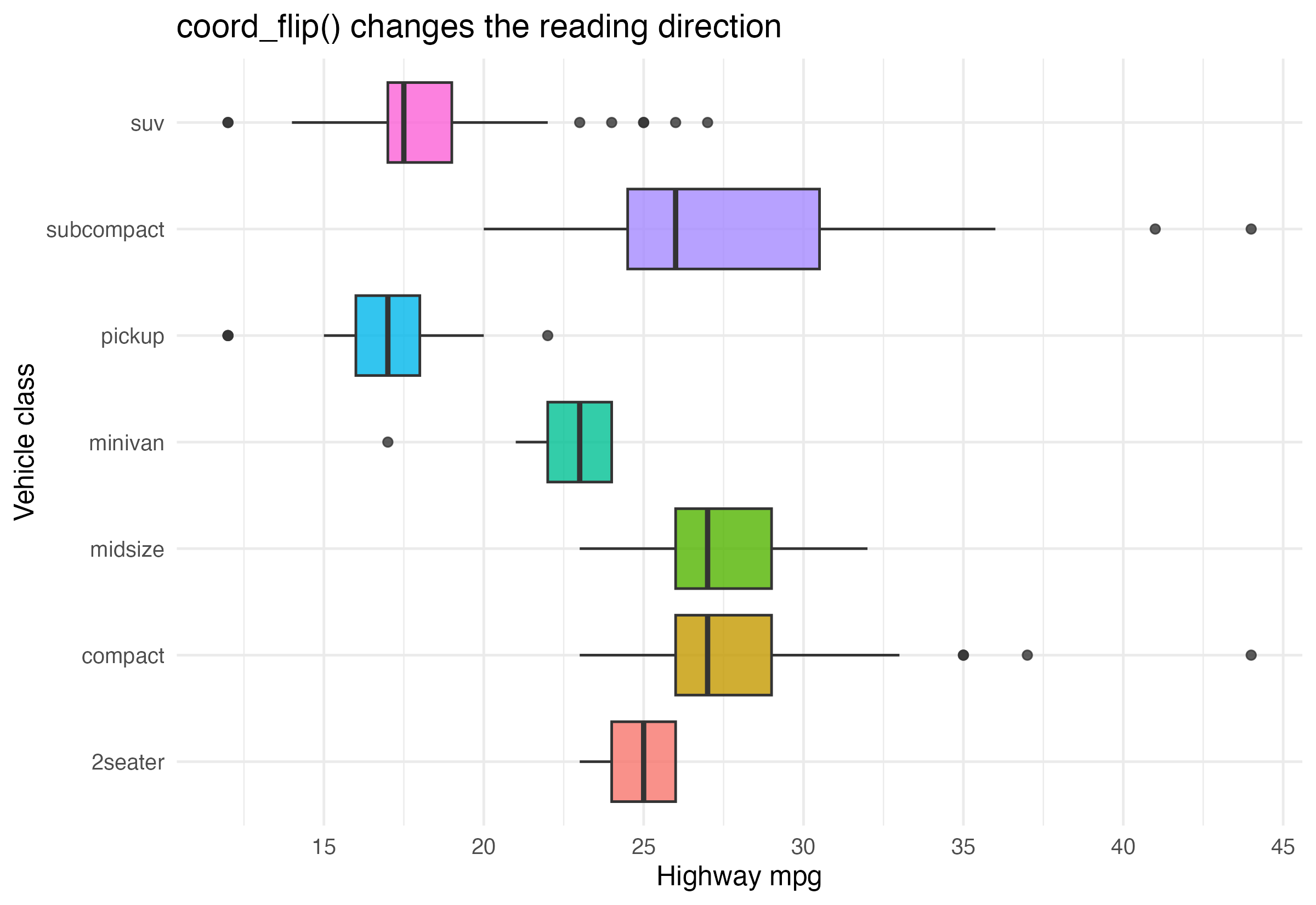
Step 3: Control Coordinates and Axis Readability
Coordinates are not just a mathematical detail. They shape how the plot is read.
ggplot(mpg, aes(x = class, y = hwy, fill = class)) +
  geom_boxplot(show.legend = FALSE) +
  coord_flip() +
  scale_y_continuous(breaks = seq(10, 45, by = 5))
This version is easier to scan than the vertical version because long category labels are often more readable after flipping.
Step 4: Choose the Structure Before Styling
A useful beginner rule is:
- if one panel is readable, keep one panel
- if one panel is crowded, try facets
- if labels are awkward, try coordinates
- if comparisons become misleading, rethink scales before changing theme
Structure comes before polish.
How to Confirm It Worked
- Your script creates:
R draw/figures/05-facet-scatter.pngR draw/figures/05-facet-distribution.pngR draw/figures/05-coordinate-example.png
- You can explain why
facet_wrap()andfacet_grid()are not interchangeable. - You can explain why
free_ychanges interpretation.
Common Questions
When should I keep fixed scales?
Keep fixed scales when you want direct visual comparability across panels. If every panel uses a different range, the reader may overestimate small differences.
When are free scales helpful?
They are useful when groups have very different ranges and fixed scales would flatten important local patterns.
Does coord_flip() change the underlying data?
No. It changes only the coordinate presentation, not the data values.
Review Score
Score: 93/100 Verdict: This draft is ready for human review and gives beginners a clear path from crowded plots to better structured comparisons.
Show Explanation
Score Breakdown
- Accuracy: 24/25. The article uses facets, scales, and coordinates in standard and well-motivated ways.
- Beginner friendliness: 23/25. The structure-first emphasis is helpful, though a future revision could add one more fixed-vs-free example.
- Reproducibility: 24/25. The script generates all example panels directly from stable datasets.
- Professional judgment and risk handling: 22/25. The article warns that free scales can improve readability while weakening direct comparability.
Review Notes
- Ready for human review.
- Before publication, consider adding a short sentence about
coord_fixed()even if the visual focus stays oncoord_flip().
```
Personnel
- ✍ Creator: Chenglin Cai
- 🤖 AI Collaboration: ChatGPT
- 🧪 Data Provider: palmerpenguins and ggplot2 datasets
- 💻 Code Contributor: ChatGPT